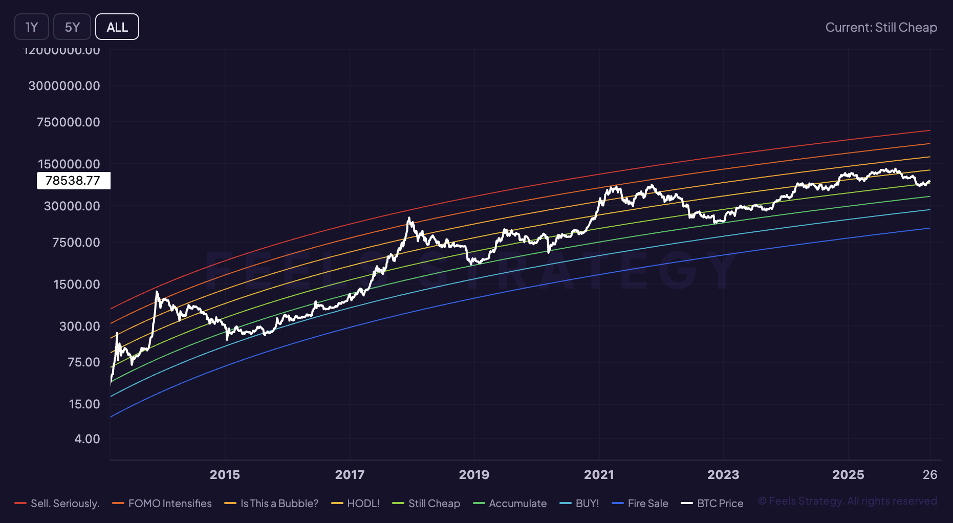
Rainbow Chart
The Rainbow Chart places Bitcoin price inside long-term logarithmic valuation bands. It is a simple visual framework that helps investors think in broad accumulation and euphoria zones.
Chart preview
Rainbow Chart inside the live workspace
The live workspace is available right away, so this preview section acts as a visual bridge between the explainer and the interactive chart.
Market use
Rainbow Chart is usually read as where BTC may sit inside a larger market cycle inside the broader Bitcoin stack.
Live access
This guide and the live chart are both open, so you can move straight from the explainer into the interactive view.
Next step
Use the explainer here, then move into the app to compare this signal with related indicators and live BTC price context.
What it measures
It maps price to colored bands around a long-term logarithmic trend.
It turns a noisy market into an easy visual range for macro positioning.
It is intentionally high level and should not be mistaken for a precise valuation model.
How it is calculated
- The chart is built from a logarithmic regression curve fitted to long-term BTC price history.
- Upper and lower bands are then layered around that curve to form valuation zones.
- Those bands are descriptive guides, not fixed support and resistance levels.
How it behaved in past cycles
- Lower bands were historically associated with long-term accumulation and market fear.
- Upper bands tended to align with late-cycle excitement and aggressive upside extension.
- Because the framework is heuristic, it should be used with other market evidence.
How traders usually use it
- Use Rainbow Chart to frame where BTC may sit inside a larger market cycle before reacting to shorter-term BTC price moves.
- Compare the current reading with prior cycle extremes instead of reacting to a single daily move in isolation.
- Pair it with Halving Cycles and Stock-to-Flow Model so one signal is confirmed from a second angle.
Common mistakes
- Do not treat Rainbow Chart as a standalone buy or sell trigger without broader confirmation.
- Avoid reading one spike as decisive when the indicator is meant to describe slower where BTC may sit inside a larger market cycle.
- Always check price trend, liquidity, and sentiment together before turning an indicator reading into a trade thesis.
Questions investors ask
What does Rainbow Chart tell you?
The Rainbow Chart places Bitcoin price inside long-term logarithmic valuation bands. It is a simple visual framework that helps investors think in broad accumulation and euphoria zones.
How should investors use Rainbow Chart?
Because the framework is heuristic, it should be used with other market evidence. It works best as context, then gets confirmed with price trend, macro conditions, or related indicators.
Can you access Rainbow Chart in FEELS Analytics?
This guide and the live chart are both open, so you can move straight from the explainer into the interactive view.
Ready to explore Rainbow Chart on live data?
Open the interactive Rainbow Chart chart inside FEELS Analytics and compare it with the rest of the indicator library in the app.